Mobile layouts added for login and onboarding screens
The initial setup flow is now fully responsive, allowing users to log in, create organizations, and configure projects from mobile devices.
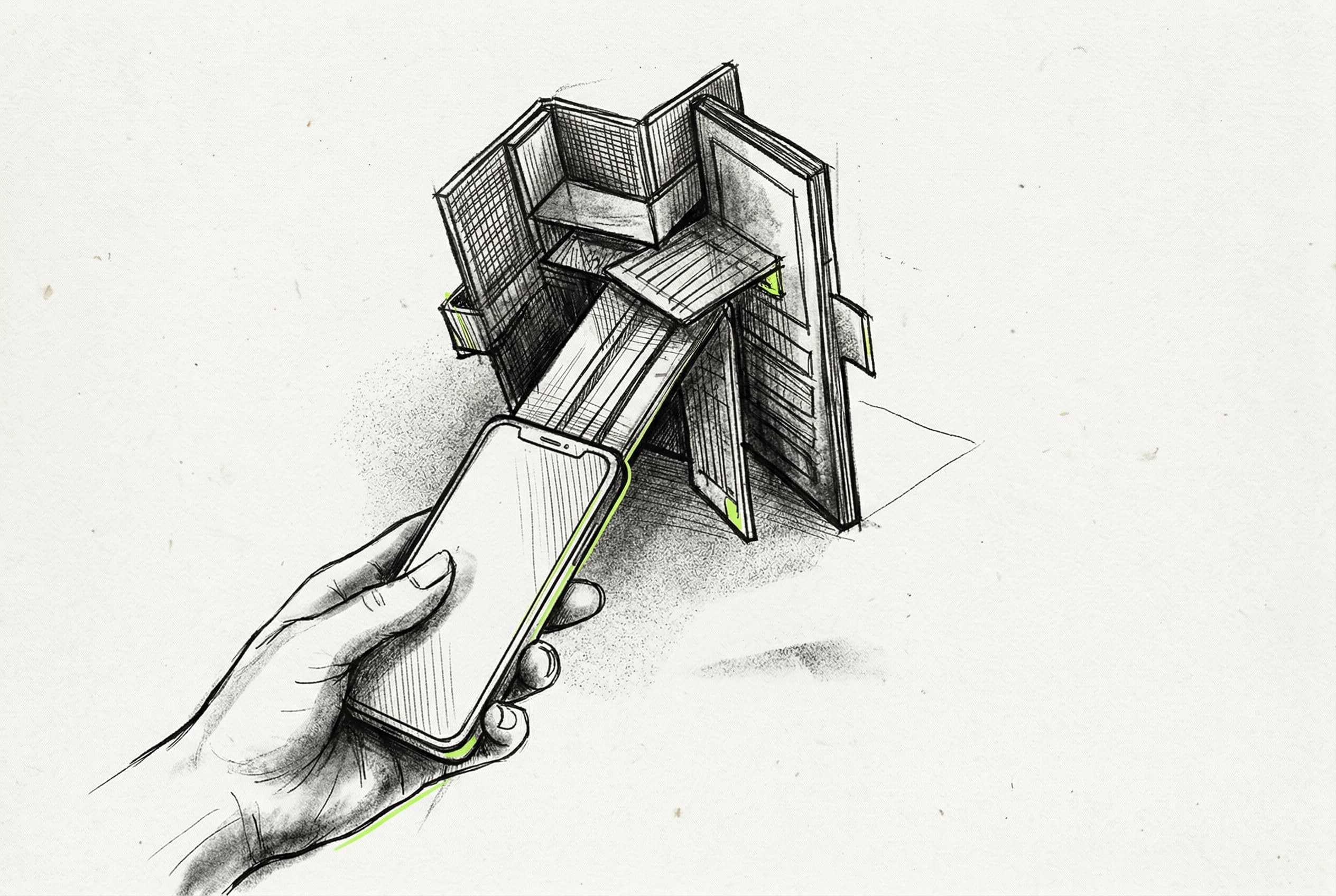
The webapp onboarding and login screens are now fully usable on mobile devices. Viewport breakpoints are adjusted to handle smaller screens gracefully, prioritizing core forms and actions over structural columns.
Decorative background images and secondary sidebars are explicitly hidden on mobile views to prevent horizontal overflow and visual clutter. Core layout containers are updated to support a dedicated onboarding variant, which manages spacing and padding dynamically based on screen size. Developers can log in, create organizations, set up projects, and complete the entire onboarding flow directly from their phones.
View Original GitHub DescriptionFact Check
Simple responsive breakpoint changes to the 3 onboarding screens + the login screen to make it mobile friendlier
<img width="523" height="872" alt="CleanShot 2026-04-02 at 17 18 55" src="https://github.com/user-attachments/assets/815d19ca-df9b-4b3e-8f6d-e00c81628679" />